GRAY LINE BRAND
  • How-To
  • REQUIREMENTS
    • Vehicles
    • Health & Safety
    • The Logo
    • The Tagline
    • The Color
    • The Font
  • COVID-19 Messaging
  • Best Practices
    • COVID-19 Health & Safety
    • Gray Line Examples >
      • Vehicles
      • Diamond Design Layer
      • Business Cards
      • Brochures
      • Staff Uniforms
    • Co-Branded Examples >
      • Business Cards
      • Vehicles
  • Vehicle Examples

Corporate logo suite

LOGO INTRODUCTION
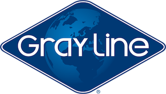
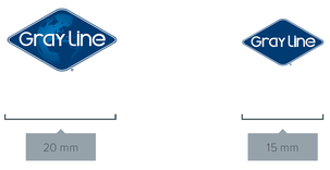
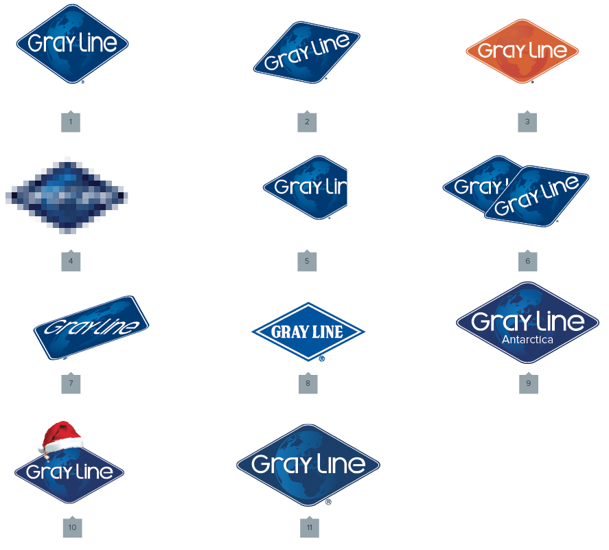
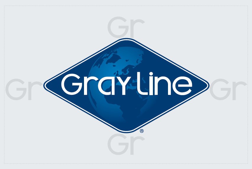
Our logo is the fundamental building block of our identity: the primary visual element that identifies us. The logo is a combination of the blue diamond itself and our company name - they have a fixed relationship that should never be changed in any way.

The diamond is a powerful image evoking the culture of quality and experience we provide our customers. The custom font has been carefully chosen for its modern yet refined, highly legible style. The corporate logo is presented through the use of color, as well as shape and form. The corporate color is blue, it is a strong and appealing color chosen for its combination of attributes: modern, classic, timeless.

the Gray Line logo


Picture
Preferred Gray Line Logo
The Mono Logo
This logo has always been part of the approved branding portfolio, but as mono-chromatic designs have become more popular due to their simplicity, cleanliness, and ease of applying across any medium, this is now the official "Preferred Gray Line Logo." 

The preferred logo's best use cases are any/all digital or print related instances. Examples; websites, brochures, employee uniforms & smaller vehicle logos.

Download logo files

JPEG
​
.JPG

​indesign
​
.AI

VECTOR
​
.EPS

PNG
​
.PNG

*If the files open in your web browser, just right click the logo and choose "Save image as" to save the file to your computer.

Picture
The Legacy Logo
This logo is still an official Gray Line logo and can still be used. The best use cases for the legacy logo are instances where the logo is very large. Examples; store front signage/banners/flags & full-size motor coach logos.

Download LEGACY logo files

JPEG
​

.JPG

​indesign
​
.AI

VECTOR
​
.EPS

PNG
​
.PNG

*If the files open in your web browser, just right click the logo and choose "Save image as" to save the file to your computer.
​LOGO CLEARSPACE AND COMPUTATION
​

It is required to keep corporate marks clear of any other graphic elements. To regulate this, an exclusion zone has been established around the corporate mark. This exclusion zone indicates the closest any other graphic element or message can be positioned in relation to the mark itself and our company name – they have a fixed relationship that should never be changed in any way. 
Picture
Definition
Whenever the logo is used, it should be surrounded with clear space to ensure its visibility and impact. No graphic elements of any kind should invade this zone (background images excluded).

Computation
To calculate the clear space, take the letters ‘GR’ from the logo and place them next to each point of the diamond. The size of the ‘GR’ should match the size being used on the logo at any given time. When sub-branded elements like "Sightseeing Everywhere" are used, the spacing adjusts. See Tagline section for examples.

Mono logo color

Picture
Picture
Gray Line Blue
CMYK: C100 M86 Y22 K8
​Pantone: 654C
RGB: R0 G62 B126
​Web: #003e7e

LEGACY logo colorS

Picture
Picture
Dark Blue
CMYK: C100 M70 Y00 K40
​Pantone: 281C
RGB: R8 G49 B96
​Web: #001f5b  ​
Picture
Light Blue
CMYK: C100 M40 Y0 K0
Pantone: 7461
RGB: R60 G60 B59
​Web: #3c3c3b
 

logo application

The examples below show how the Gray Line logo should and should not be used. Please follow this guide to make sure The Gray Line Brand is used correctly. 

​
MINIMUM LOGO SIZES

​The Gray Line legacy logo should never be used smaller than 20 mm wide with the height scaled proportionately. If the size must be smaller than 20 mm, the mono logo must be used and no sub-branded elements should be included. 

Picture
INCORRECT APPLICATIONS
Picture

  1. Never stretch the logo out of proportion. The logo must always be scaled proportionately. 
  2. Never rotate the logo or position it upside-down on marketing materials. It should always sit upright so the logo text reads on a straight line. 
  3. Never change the logo color to suit your marketing materials. The logo should always be presented in the corporate colors. 
  4. Always use a high resolution logo as it should never be pixelated. 
  5. Never crop into the logo. The clear space guide should always be implemented. 
  6. Never overlay another graphic or image on top of the logo. The clearspace guide should always be implemented. 
  7. Never skew the logo. 
  8. Old style logo never to be used. 
  9. Never add elements to the original logo. 
  10. Never add any decorative objects touching the logo.
  11. Never use the Gray Line logo where the "i" in "Line" is not dotted.
Proudly powered by Weebly
  • How-To
  • REQUIREMENTS
    • Vehicles
    • Health & Safety
    • The Logo
    • The Tagline
    • The Color
    • The Font
  • COVID-19 Messaging
  • Best Practices
    • COVID-19 Health & Safety
    • Gray Line Examples >
      • Vehicles
      • Diamond Design Layer
      • Business Cards
      • Brochures
      • Staff Uniforms
    • Co-Branded Examples >
      • Business Cards
      • Vehicles
  • Vehicle Examples